Simplicity is king.

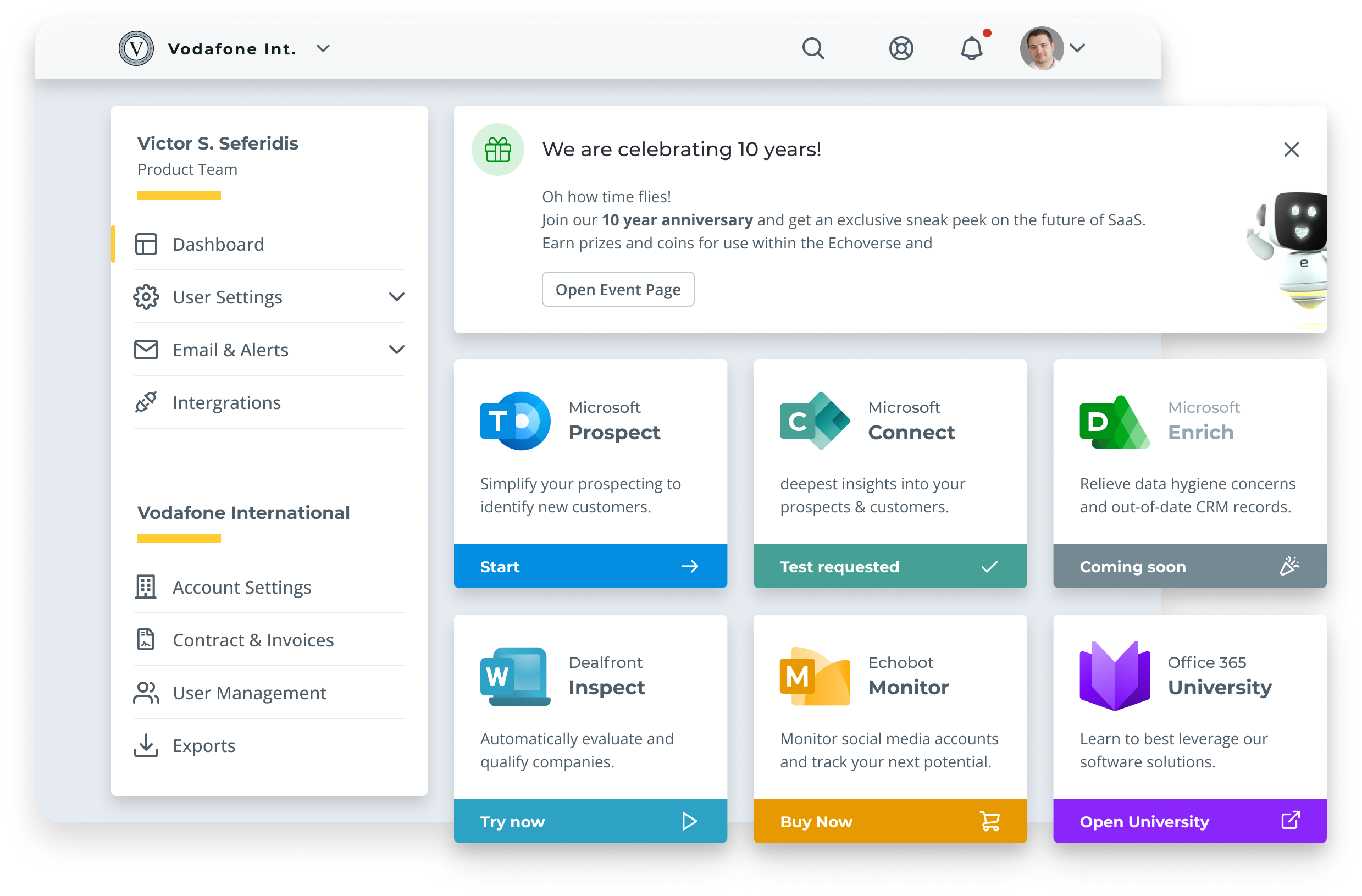
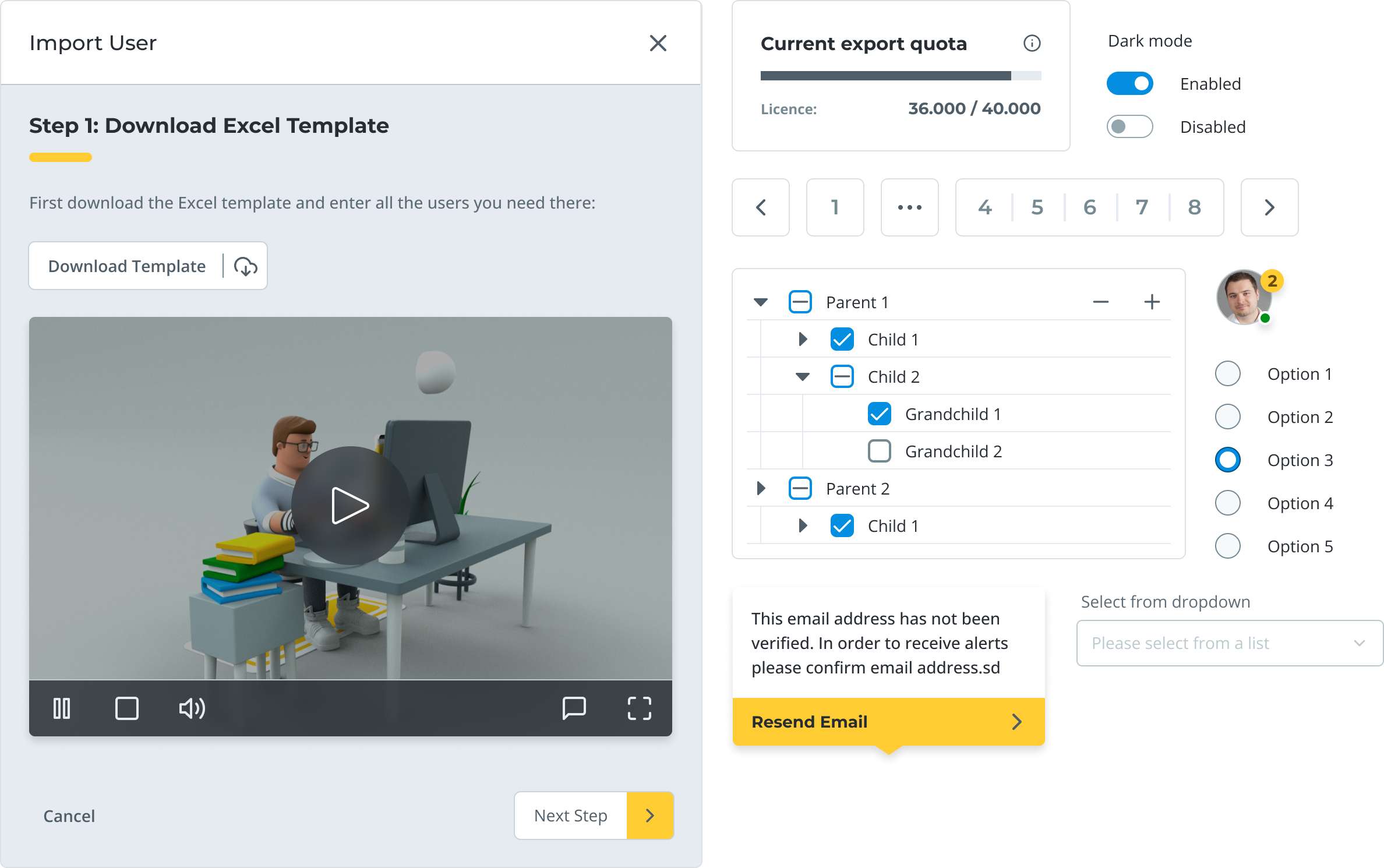
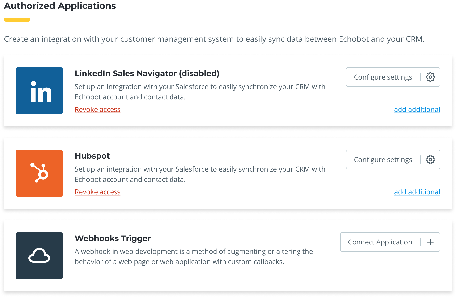
As a manager of a SaaS team, designers must know how important dashboards are for customers.

Generaly speaking, dashboards must convey the message that they provide a centralized location for accessing all the features and tools they need, as well as view and analyze key metrics and data. So, when it comes to designing a dashboard, I usually establish a process to follow a few key steps.

Understand the vision

First and foremost, make sure that the goals and objectives for dashboard are defined and exist in written form. You will need those “success-criteria” as you will be making the user journey. This will also help you figure out what information to include and how to present it. I always keep in mind the target audience for the dashboard and what they’ll find most useful and relevant and at what spot.

Next up, you’ll want to gather and organise all the data and features you want to include on your dashboard. Do users need X and if so how prominently?

In my case we wanted a quick way for users to launch app from a centralised place, that would also include objects like [events, news, banners, promos, apis, alerts, settings, invoices… etc] .This might involve working with different departments within the company to get everything that is necessary and deciding how to group it all together.

Break down features into tasks

Then, it’s time to get creative and design the layout and visuals of the dashboard. This includes deciding on the overall structure and organization, as well as choosing charts, graphs, and other visualizations to represent the data. I make sure to keep things visually appealing and easy to understand, so users can quickly find what they’re looking for.

Don't forget the user!

Finally, don’t forget to test and refine your dashboard based on user feedback. Get a small group of people to try it out and see what they think. Make any necessary improvements based on their suggestions.
In summary, dashboards are a handy tool for SaaS companies because they provide a central hub for users to access all the features and tools they need, as well as view and analyse important data.
By following a structured design process and gathering user feedback, you can create a dashboard that’s effective and user-friendly.